この記事から得られること
この記事では、Google社提供の「マテリアルデザイン」UIガイドラインの「Understanding typography(文字組みの理解)」の概要について学ぶことができます。
Material Design : Design section “Understanding typography”
URL:https://material.io/design/typography/understanding-typography.html
また、この章は「英語のアルファベット」に対する「Typography(文字組み)」の解説ですので、ご認識おきください。
なお、この記事は「約10〜7分」で読める内容となっています。
この記事の前提
この記事では、私が実際に「マテリアルデザイン」を読んだ経験から「理解しておくべき基本的な内容」を抜粋して紹介しています。
また、マテリアルデザインで使用されている専門用語は「英語のまま」使用しています。
理由は、日本語に翻訳しますと不自然な表現となるためです。
少し読みにくい部分もあるかもしれませんが、ご了承ください。
また、この記事は、記事上の各画像を細かく見ていただくためにも「パソコンでの閲覧」を推奨していますが、「スマホのブラウザ」でももちろん閲覧可能です。
なお、この記事を読み進めるなかで、もし分からない専門用語が多い場合は、「マテリアルデザイン」ガイドラインの最初の「概要編」の記事から順番に読み進めることをおすすめします。
マテリアルデザインにおける “Typography”
出典:Material Design : Design section “Understanding typography”
URL:https://material.io/design/typography/understanding-typography.html#type-properties
「Typography(文字組み)」の考え方は、UIデザインに限ったお話ではありませんが、マテリアルデザインでは「Typography」に関するルールを設けています。
そして、UIデザインをする際は、その「Typography」のルールに従う必要があり、この章では各ルールについて解説しています。
それでは、マテリアルデザインにおける「Typography」の各ルールについて解説します。
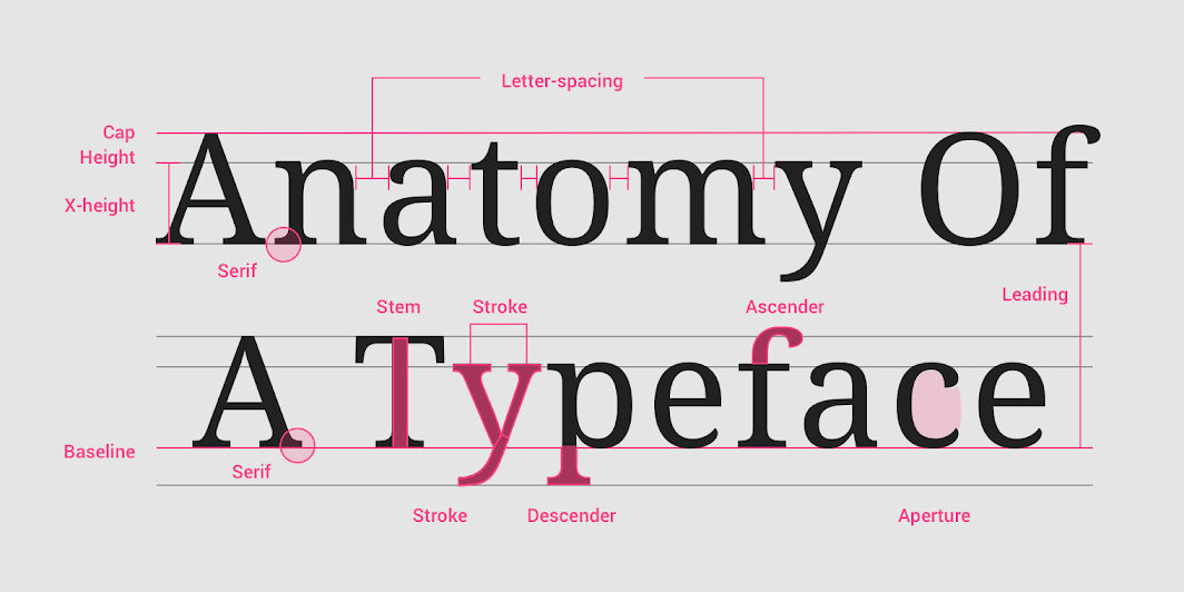
最初は文字に対する「ライン」について解説します。
“Baseline”
出典:Material Design : Design section “Understanding typography”
URL:https://material.io/design/typography/understanding-typography.html#type-properties
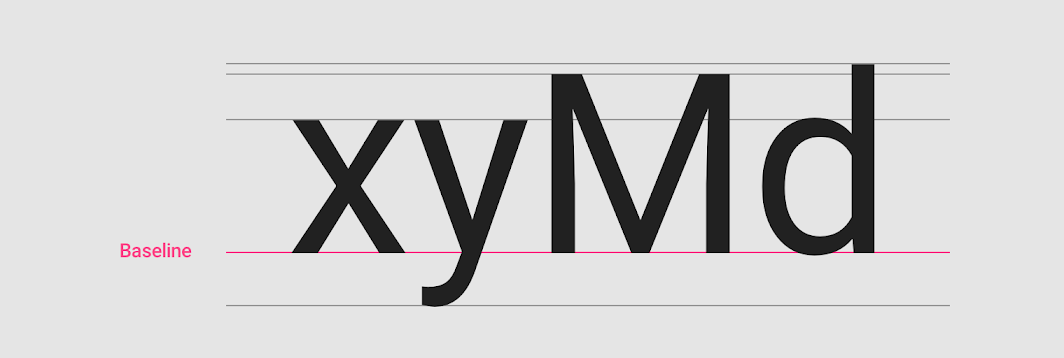
「Baseline」とは、「文字が置かれている基本的なライン」のことです。
そして「Baseline」は、「行間(文章と文章の間の余白)」を決めるための重要なラインの役割もあります。
出典:Material Design : Design section “Understanding typography”
URL:https://material.io/design/typography/understanding-typography.html#type-properties
また、マテリアルデザインでは「Baseline」は文字のサイズに関係なく、上の図のように「4dp」の「Gridline」上に配置することが規定されています。
そのため、行の高さは「4」で割り切れる単位にする必要があります。
出典:Material Design : Design section “Understanding typography”
URL:https://material.io/design/typography/understanding-typography.html#type-properties
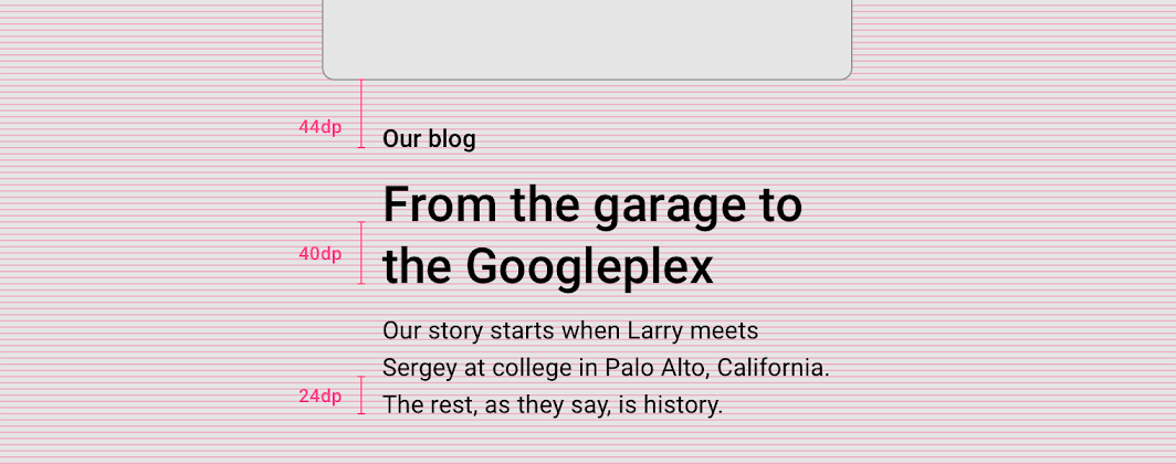
上の図のように「Baseline」を基準に、各文章の高さ(つまり行間)を指定します。
出典:Material Design : Design section “Understanding typography”
URL:https://material.io/design/typography/understanding-typography.html#type-properties
上の図は、コンポーネント内で「各文章の行間」を規定している例です。
“Height”
出典:Material Design : Design section “Understanding typography”
URL:https://material.io/design/typography/understanding-typography.html#type-properties
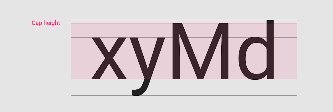
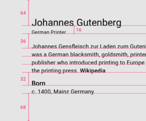
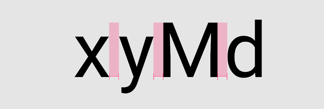
上の図のように、文字には「Cap height」と呼ばれる「文字の高さ」があります。
基本的には、各文字で固有に「Cap height」を持っています。
出典:Material Design : Design section “Understanding typography”
URL:https://material.io/design/typography/understanding-typography.html#type-properties
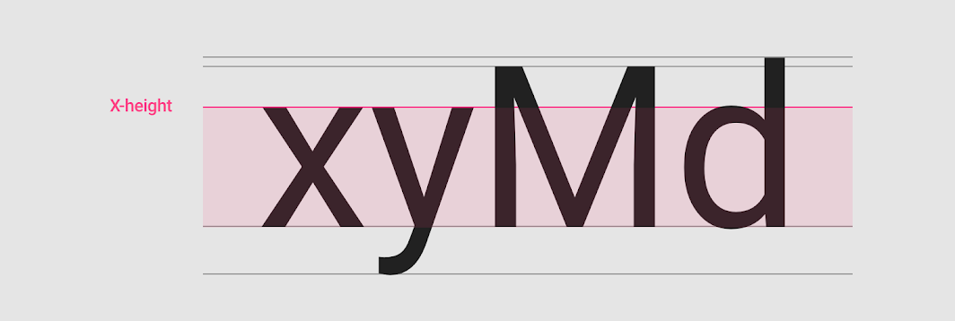
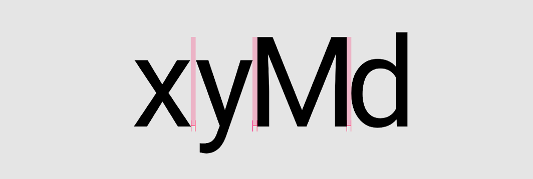
また上の図のように、「Cap height」とは別に「x-height」と呼ばれる「文字の高さ」もあり、「x-height」が「小文字の高さ」の基準となります。
“Ascender” and “Descender”
出典:Material Design : Design section “Understanding typography”
URL:https://material.io/design/typography/understanding-typography.html#type-properties
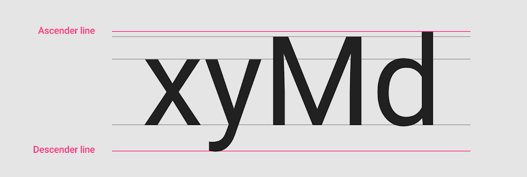
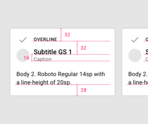
そのほかにも、上の図のような「Ascender」と「Descender」と呼ばれるラインがあります。
「Ascender」は「Cap height」よりも高い高さを持つ文字に適用される高さのラインです。
そして「Descender」は「Baseline」よりも下に書く文字に適用されるラインのことです。
それでは次に「フォント(書体)」について詳しく解説します。
“Weight”
出典:Material Design : Design section “Understanding typography”
URL:https://material.io/design/typography/understanding-typography.html#type-classification
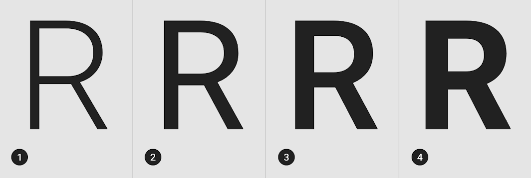
「フォント(書体)」には「Weight」という概念があり、これはフォントの「太さ」を表しています。
基本的には、1つのフォントに対して4〜6種類ほどの「Weight」があり、上の図は、
- ①:Light
- ②:Regular
- ③:Medium
- ④:Bold
の4種類の「Weight」の例となっています。
それでは次に「代表的なフォントの種類」について解説します。
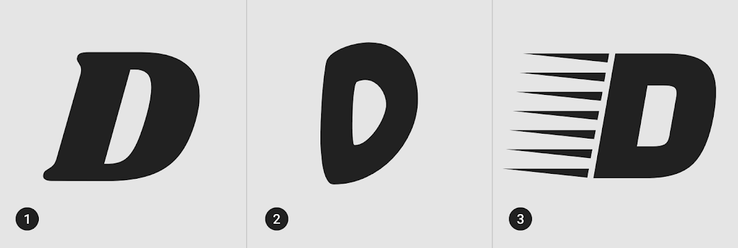
“Serif”
出典:Material Design : Design section “Understanding typography”
URL:https://material.io/design/typography/understanding-typography.html#type-classification
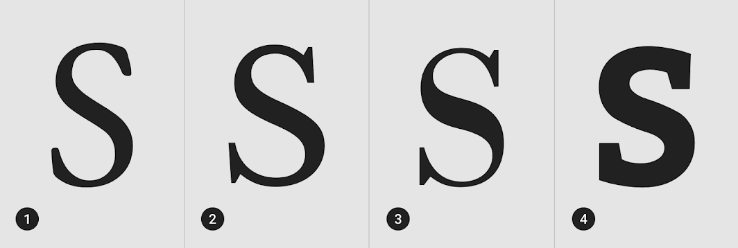
フォントには「Serif(セリフ体)」と呼ばれる書体があります。
上の図のように、文字の書き出しや書き終わりに「突起」が付いているのが「Serif」の特徴です。
“Sans Serif”
出典:Material Design : Design section “Understanding typography”
URL:https://material.io/design/typography/understanding-typography.html#type-classification
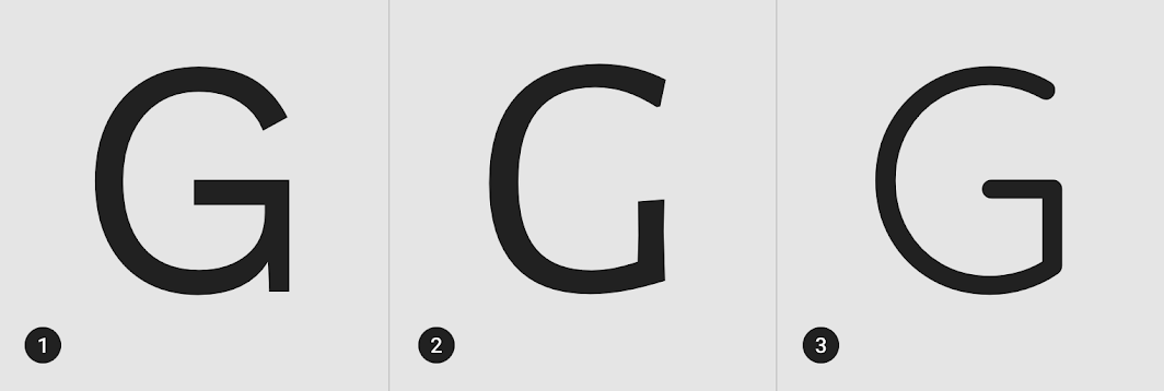
「Serif」とは対称的に、上の図のように、文字の書き出しや書き終わりに「突起」が付いていないフォントを「Sans Serif(サンセリフ体)」と呼びます。
「Sans」とはフランス語で「無し」を意味します。
“Monospace”
出典:Material Design : Design section “Understanding typography”
URL:https://material.io/design/typography/understanding-typography.html#type-classification
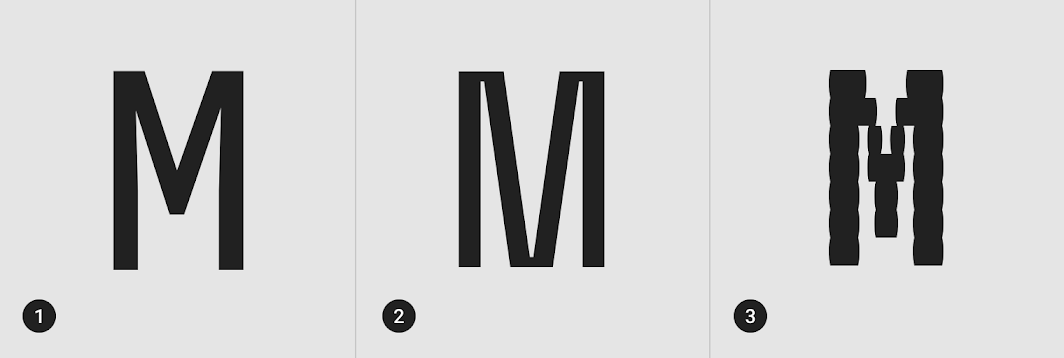
そのほかにも上の図のように、「Monospace」と呼ばれる、全ての文字が等幅(ヨコ幅が等しい)フォントもあります。
“Handwriting”
出典:Material Design : Design section “Understanding typography”
URL:https://material.io/design/typography/understanding-typography.html#type-classification
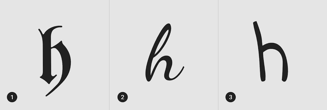
また、上の図のような手書き風の「Handwriting」と呼ばれるフォントもあります。
この「Handwriting」のフォントは、基本的に「Type scale」の「H1〜6」に対して使用されます。
“Display”
出典:Material Design : Design section “Understanding typography”
URL:https://material.io/design/typography/understanding-typography.html#type-classification
また、上の図のような「Display」と呼ばれるフォントもあります。「Display」も「Handwriting」と同様、基本的には「Type scale」の「H1〜6」に対して使用されます。
それでは次に「文字の読みやすさ」に関するルールを解説します。
“Letter-spacing”
出典:Material Design : Design section “Understanding typography”
URL:https://material.io/design/typography/understanding-typography.html#readability
文字と文字の間隔のことを「Letter-spacing」と呼びます。
文章の見出しでは、上の図のように「Letter-spacing」を狭くすることにより、読みやすさを向上させています。
出典:Material Design : Design section “Understanding typography”
URL:https://material.io/design/typography/understanding-typography.html#readability
逆に上の図のように、「Letter-spacing」を多めに取ることによって「ゆったりとした印象」を与えることもできます。
“Tabular figures”
出典:Material Design : Design section “Understanding typography”
URL:https://material.io/design/typography/understanding-typography.html#readability
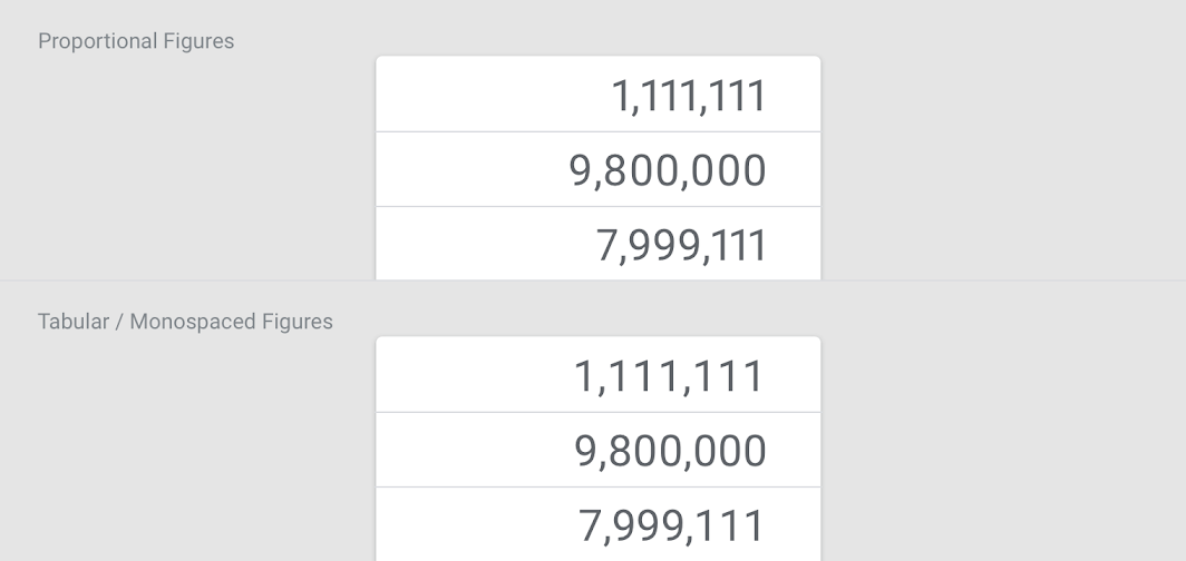
数字が使用される表である「Tabular figrures」では、「Proportional digits(文字詰めした数字)」ではなく、上の図のように、各数値を比較しやすいように「Monospaced digits(等幅の数字)」を使用する必要があります。
“Line length”
出典:Material Design : Design section “Understanding typography”
URL:https://material.io/design/typography/understanding-typography.html#readability
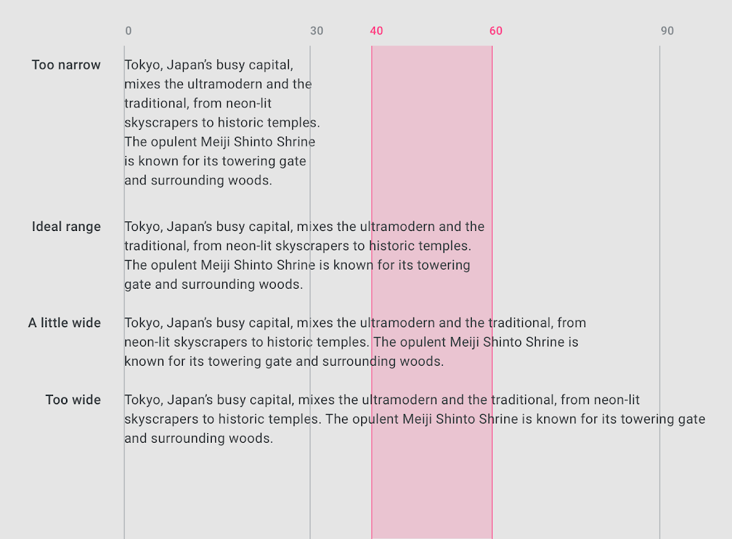
文章の1行の長さを「Line length」と呼びます。
「Line length」は英字で「40〜60文字」が理想とされており、上の図ですと、「赤塗りのエリア」が理想の「Line length」とされています。
ただ、PCなどの表示領域が広いUIにおいては「120文字」まで許容され、その際は「行間」を「20〜24sp」ほど確保する必要があります。
出典:Material Design : Design section “Understanding typography”
URL:https://material.io/design/typography/understanding-typography.html#readability
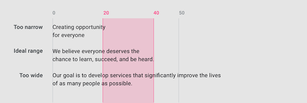
なお、短い文章の場合の「Line length」は「20〜40文字」が理想とされています。
“Line height”
出典:Material Design : Design section “Understanding typography”
URL:https://material.io/design/typography/understanding-typography.html#readability
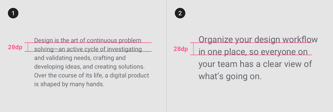
「行間(行の高さ)」は「Line height」と呼ばれ、上の図のように基本的には「文字のサイズ」によって変化させます。
“Paragraph spacing”
出典:Material Design : Design section “Understanding typography”
URL:https://material.io/design/typography/understanding-typography.html#readability
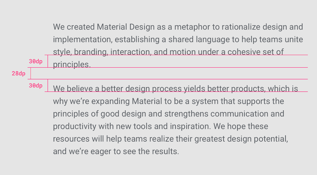
「Paragraph spacing(段落の間隔)」は、上の図のように、文字サイズに対して「0.75〜1.25倍」の高さとすることが推奨されています。
“Type alignment”
「Type alignment(文字の整列)」には3つの種類があります。
出典:Material Design : Design section “Understanding typography”
URL:https://material.io/design/typography/understanding-typography.html#readability
1つ目の「Type alignment」は「Left-aligned(左揃え)」です。
上の図のように、英語などの「左から右へ書かれるテキスト」に対して一般的に使用される「Type alignment」です。
出典:Material Design : Design section “Understanding typography”
URL:https://material.io/design/typography/understanding-typography.html#readability
2つ目の「Type alignment」は「Centered(中央揃え)」です。
上の図のように、ほかの文章と区別して強調したい場合などに「Centered」は使用されます。
ただし、「Centered」は長い文章への適用は推奨されていません。
出典:Material Design : Design section “Understanding typography”
URL:https://material.io/design/typography/understanding-typography.html#readability
3つ目の「Type alignment」は「Right-aligned(右揃え)」です。
上の図のように、サイドノート(補足説明)を記載するのに適していますが、長い文章への使用には適していません。
それでは最後に「System font」について解説します。
“System fonts”
出典:Material Design : Design section “Understanding typography”
URL:https://material.io/design/typography/understanding-typography.html#system-fonts
「System font」は、プラットフォーム(OS)にあらかじめインストールされているフォントのことです。
Android OSでは上の図のように「Roboto system font」というフォントがあらかじめインストールされています。
基本的に、AndroidもしくはWebサイト以外では、そのプラットフォーム(OS)で推奨されている「System font」を使用してください。
出典:Material Design : Design section “Understanding typography”
URL:https://material.io/design/typography/understanding-typography.html#system-fonts
なお、iOSの場合は、上の図のように「San Francisco system font」というフォントが「System font」として規定されています。
まとめ
出典:Material Design : Design section “Understanding typography”
URL:https://material.io/design/typography/understanding-typography.html#type-properties
今回の記事では、マテリアルデザインにおける「Understanding typography(文字組みの理解)」の種類について解説しました。
マテリアルデザインに限らず「Typography」に関する基本的な内容がまとめられていますので、デザインの知識として大枠でも理解しておくことをおすすめします。
最後までお読みいただきありがとうございます。
今回の記事は以上です。
この内容がみなさんのUIデザインの勉強になりましたらうれしいです。
引き続き、UIデザインの勉強を一緒にしていきましょう。
続きを学びたい方は
なお、「マテリアルデザインの続き」を学びたい方は、よろしければこちらの記事もご確認ください。
次のガイドラインを学びたい方は
一つ前のガイドラインを学びたい方は